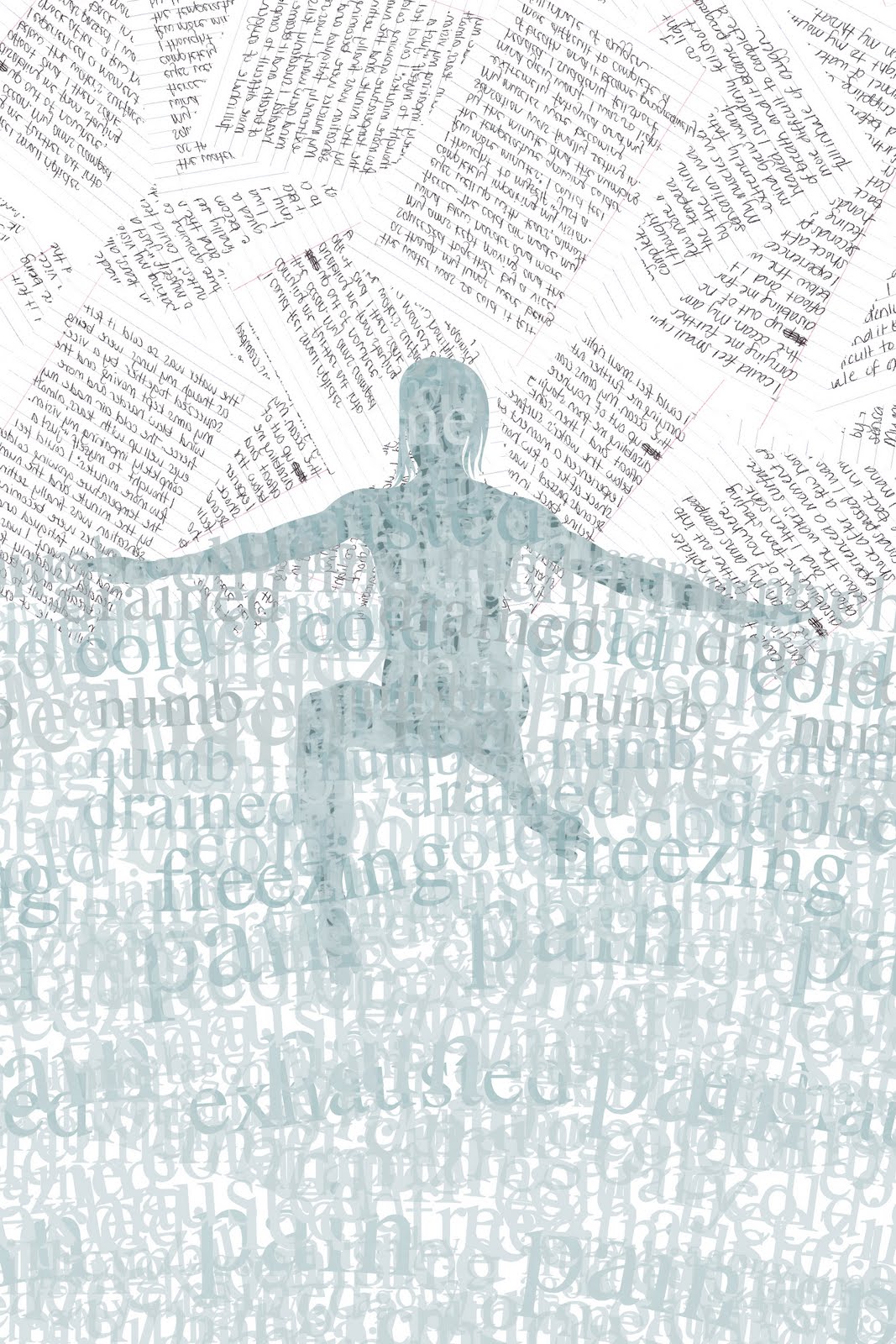
I agree. Without actually bringing in vector-based water... that is as close as I've come so far. The figure I'm now using still looks too calm for what I'm trying to portray. The hunt is still on... I'm going to make this work.
Dear Jeff, I agree with Kathryn. Also, personally, I feel like the boxy journal pages are not in agreement with the the "water" composition. They feel like she might be floating in the water with garbage, or boxes, or some other materials. (also there are two per side which makes for odd "wings.) Do you need to incorporate the journal pages into this particular spread? If you want a feeling a hand written words, how about just using just that "hand written words" instead of the "page of written words. In contrast to the computer generated text that is "underwater" you can have "hand written words" hovering above water.
I do see what you're saying. After staring at it for a few days, I actually did away with the journal pages all together and made the figure black. That decision was based on consistency, where the posters speak somewhat of a disconnected language from the book series and I liked that the posters took a break from the written words. Though I must say, your suggestion of the "hovering" hand written words sounds interesting. I'm only afraid that it might not work out quite as well in the other posters? I don't want to include something foreign to them just for the sake of keeping things consistent.


4 comments:
Jeff, I think the top one gives the feeling of water the most!
I agree. Without actually bringing in vector-based water... that is as close as I've come so far. The figure I'm now using still looks too calm for what I'm trying to portray. The hunt is still on... I'm going to make this work.
Dear Jeff, I agree with Kathryn. Also, personally, I feel like the boxy journal pages are not in agreement with the the "water" composition. They feel like she might be floating in the water with garbage, or boxes, or some other materials. (also there are two per side which makes for odd "wings.) Do you need to incorporate the journal pages into this particular spread? If you want a feeling a hand written words, how about just using just that "hand written words" instead of the "page of written words. In contrast to the computer generated text that is "underwater" you can have "hand written words" hovering above water.
I hope this helps.
I do see what you're saying. After staring at it for a few days, I actually did away with the journal pages all together and made the figure black. That decision was based on consistency, where the posters speak somewhat of a disconnected language from the book series and I liked that the posters took a break from the written words. Though I must say, your suggestion of the "hovering" hand written words sounds interesting. I'm only afraid that it might not work out quite as well in the other posters? I don't want to include something foreign to them just for the sake of keeping things consistent.
Post a Comment